Color palette
The color palettes below give you a complete overview of the Hocoma colors and how to use them.
The color palettes below give you a complete overview of the Hocoma colors and how to use them.
The primary color palette consists of a gradient and two different shades of gray, usually reserved for text (or complementary elements in diagrams).
Medium gray is mostly used for body copy and captions. Light gray is mostly used for smaller auxiliary text – like the page number, header, and footer.
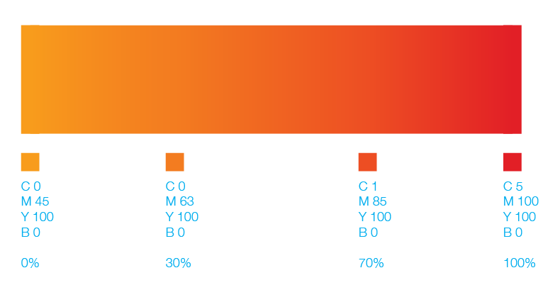
The gradient is an important element in our visual identity. It brings liveliness and energy into the look and feel of Hocoma communications.
It consists of four different swatches. It should always be used with an angle of -30°. Be sure to use the gradient with 100% fill, without opacity, multiply or other color effects.
The gradient is generally used for headlines, titles, various visual elements (such as lines, bars, boxes or background) and illustrations. Use the gradient to highlight elements. If counterproductive, please consider using other solid colours.
See graphic elements section

The secondary color palette consists of a set of colors that harmonize well with the logo and primary palette. They have been selected as an extension of the main range of tones of the identity.
These colors should be used sparingly for feature design elements – as in diagrams, infographics and presentations – and in combination with the primary palette.