Grid

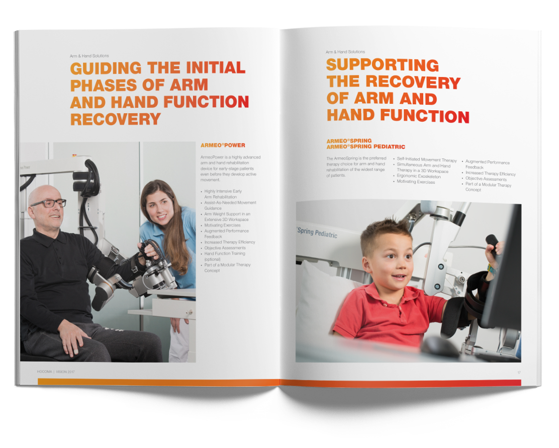
Hocoma has a versatile but easy-to-use grid. The identity – of brochures in particular – is characterized by a magazine-style layout, with large visuals, bold headlines, and an asymmetrical arrangement of text and images. For open design files please reach out to us under marketing@hocoma.com.

Universal format

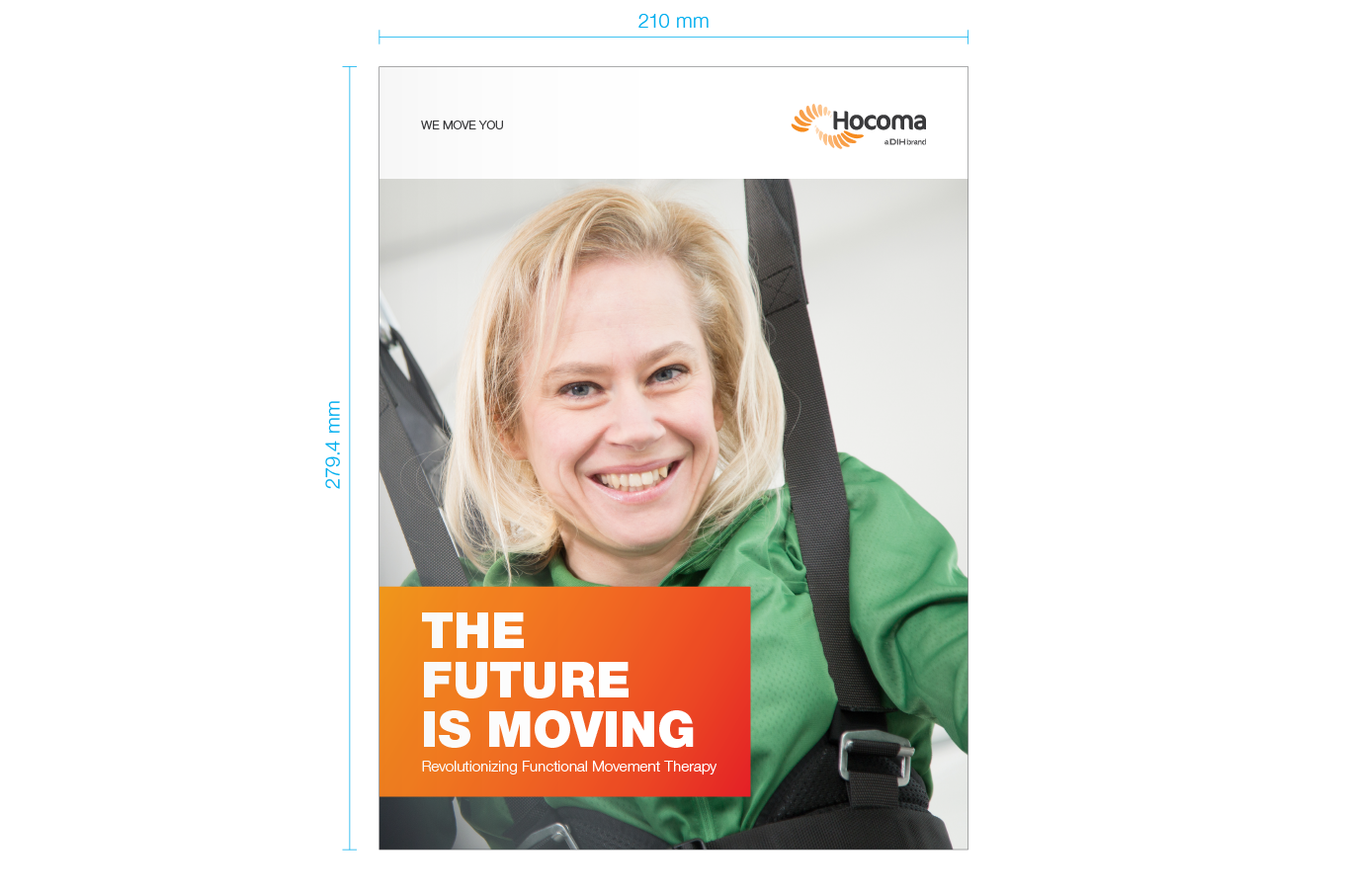
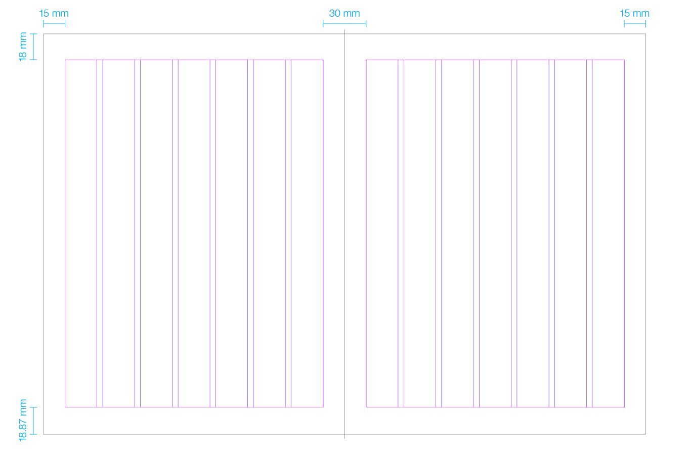
Hocoma uses a main universal format for its brochures. It combines the A4 standard with US letter size and can be printed on both formats, so there’s no need to resize documents when you’re printing files in different countries.

The single page format is 210 mm wide by 279.4 mm (11 inches) high.

Column grid

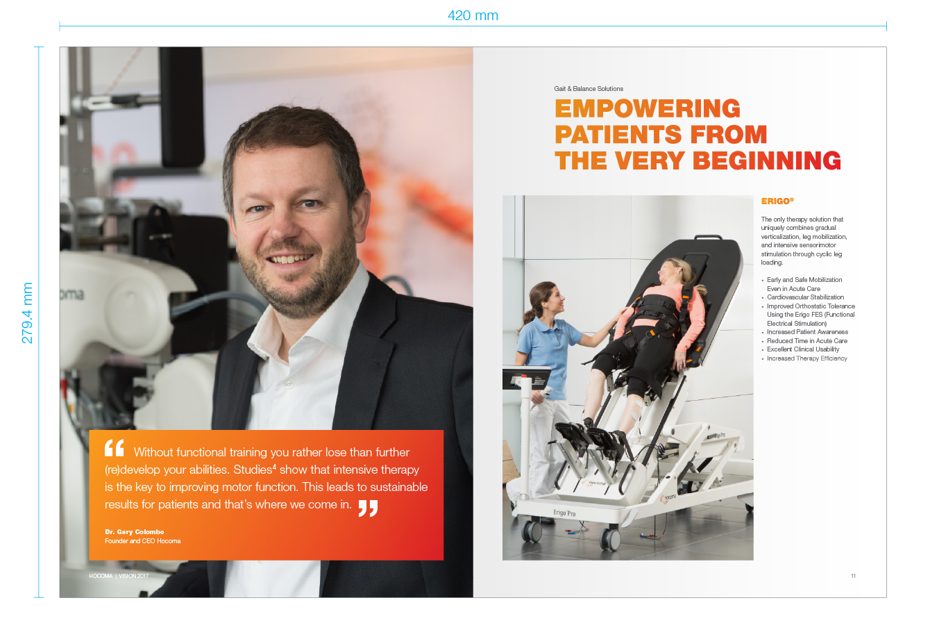
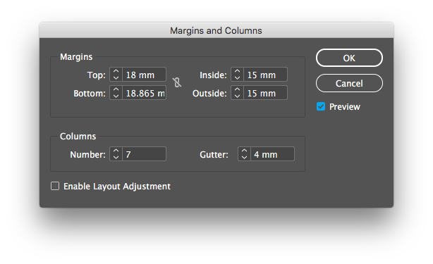
To achieve a dynamic layout of print material, we recommend a flexible use of white space. That’s why we work with a 7-columns design grid. Leaving the first or last column free of content creates a dynamic layout with white space.

For specific pages, and only if strictly necessary, the layout can be adjusted to a column grid that allows a better distribution of content (for example 3, 5 or 4 columns). But be sure to always keep consistent margins and gutters.

Baseline grid

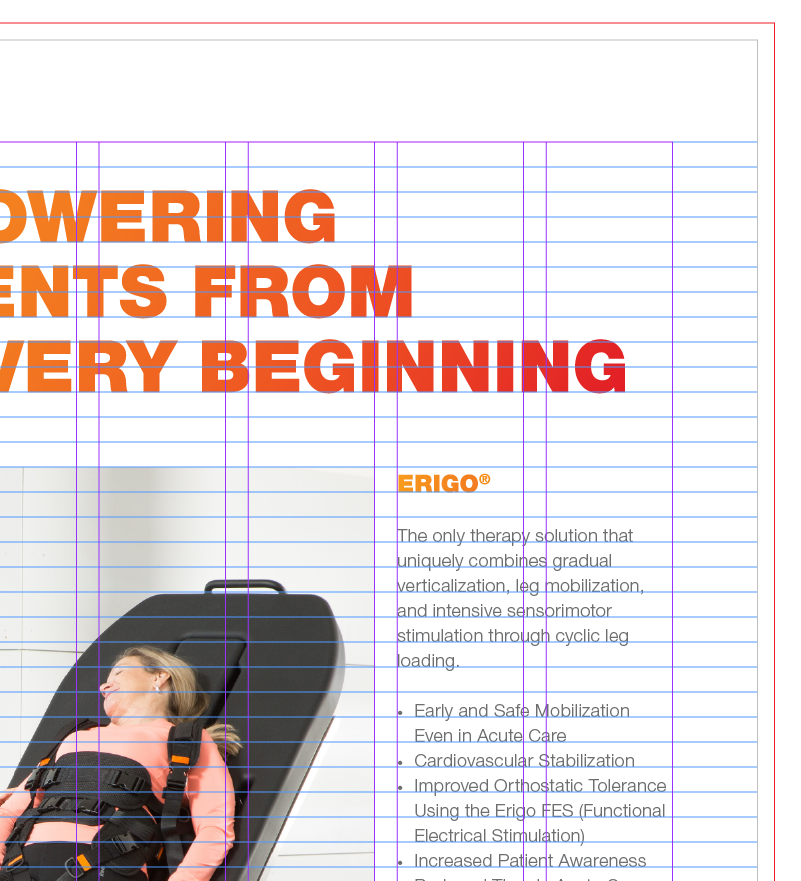
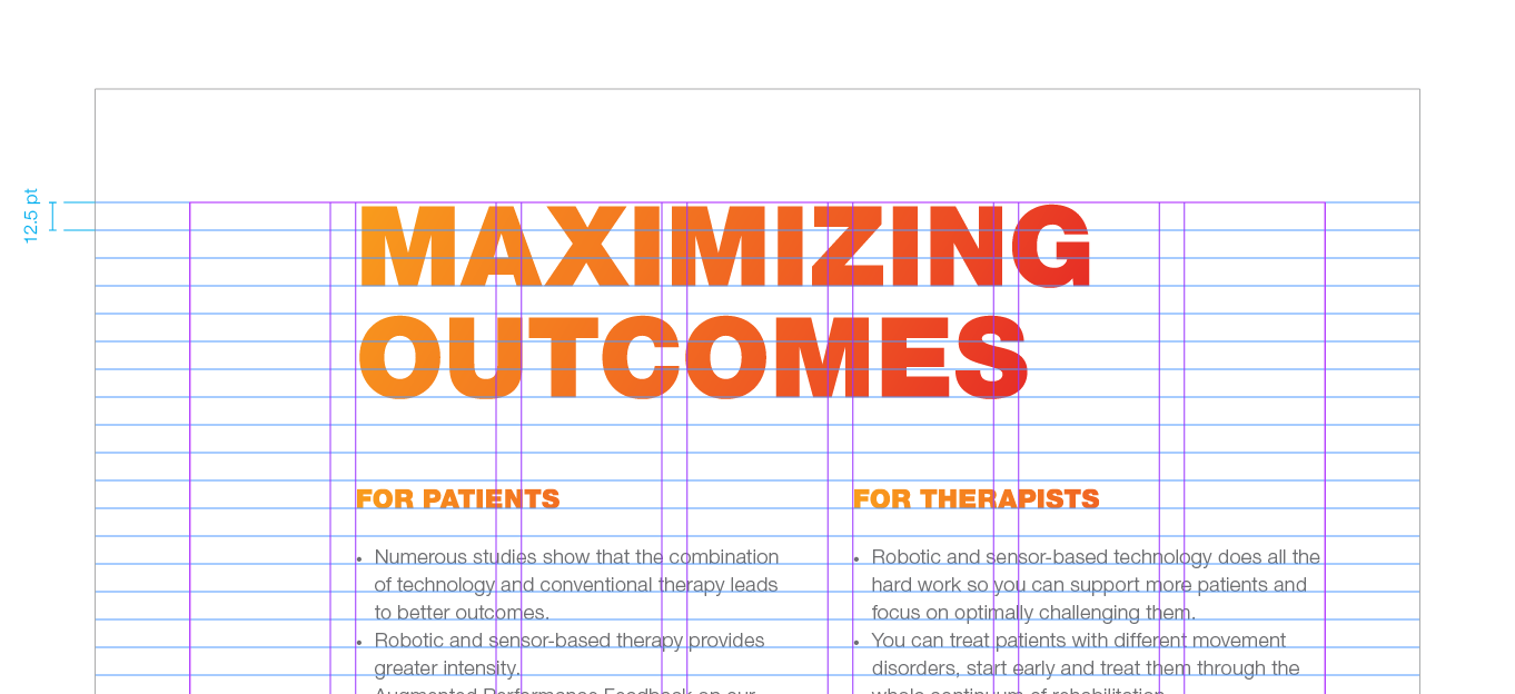
On the universal format the baseline grid has an increment of 12.5 pt, starting from the top margin.

Everything should sit on the baseline grid – especially text. Captions are the exception here: for readability, only the first line sits on the grid. Diagrams, illustrations, lines and other similar elements can occasionally break this rule, only if it helps to optically align them with other elements on the page or spread.

Please contact us in case you have any doubts on the use of the grid, or if you require a specific use of styles.

Using the grid

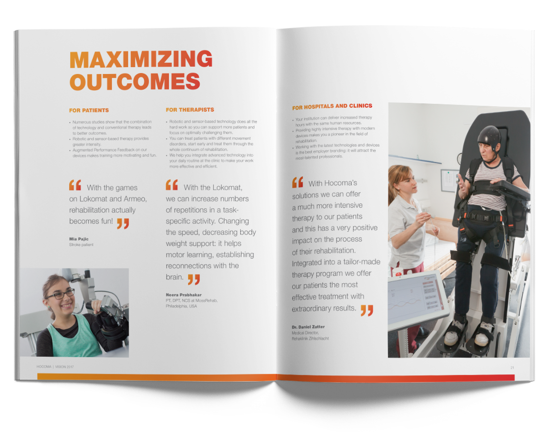
Headlines and intro copy usually occupy almost the whole width of the page (6 columns).

Body copy and captions should preferably extend over 3 columns out of 7 – so that it’s possible to have two even columns of text on the page.

Depending on the context, text columns can also extend over 2 or 4 columns out of 7.

As a general rule, the grid should be respected and used in order to achieve a dynamic use of space and an elegant balance of elements. In order to create diverse layouts, images can break the grid by going off the page or margins. Please, always try to keep the alignment with the text paragraphs.