Gradient box
The gradient box is a device used to emphasize important information, such as headlines, quotes, list of features, calls to action, or statements.
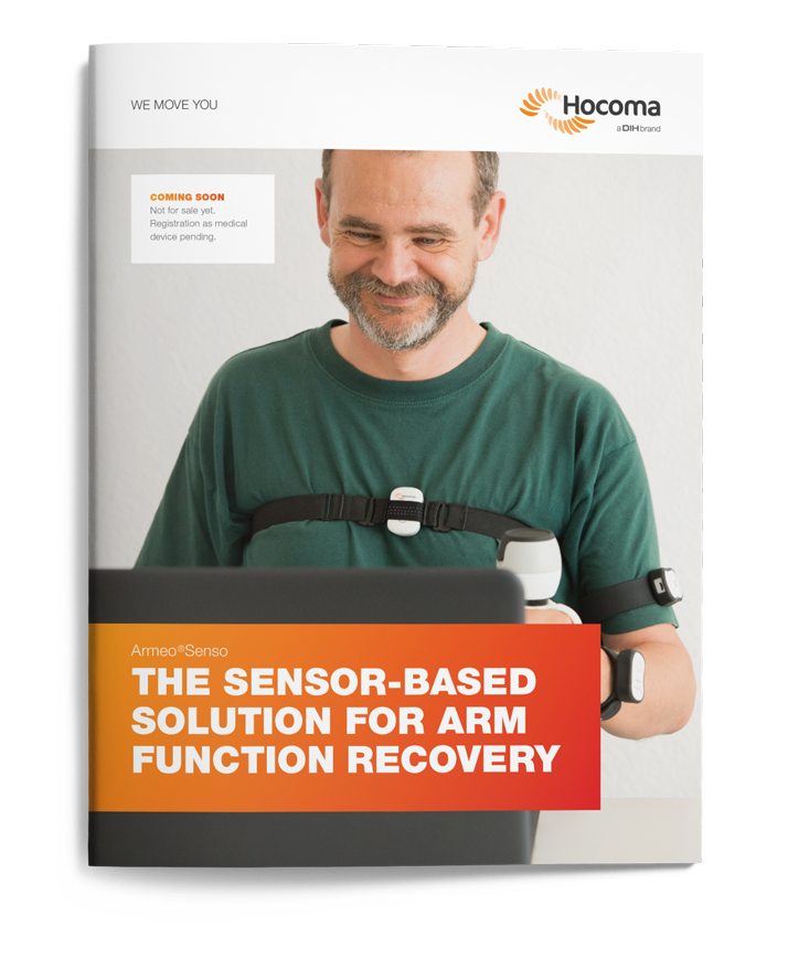
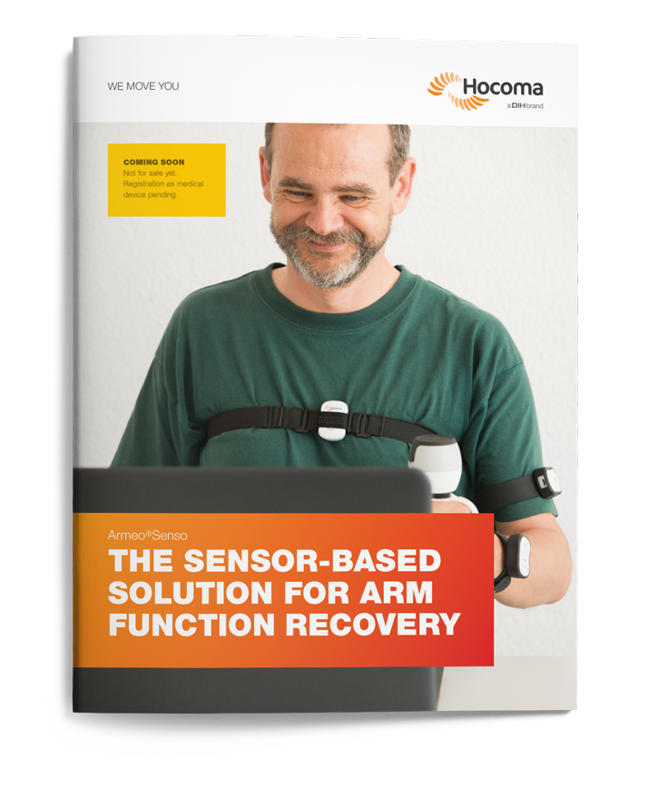
On the cover image, it is used to display the headline – bleeding off the left margin. When photography is used full bleed, you can apply only one gradient box with text over the image. The box is generally placed in the lower part of the page, or for body copy, on the side of the page covering about 1/3 of its width. The text in the gradient box should always be white.
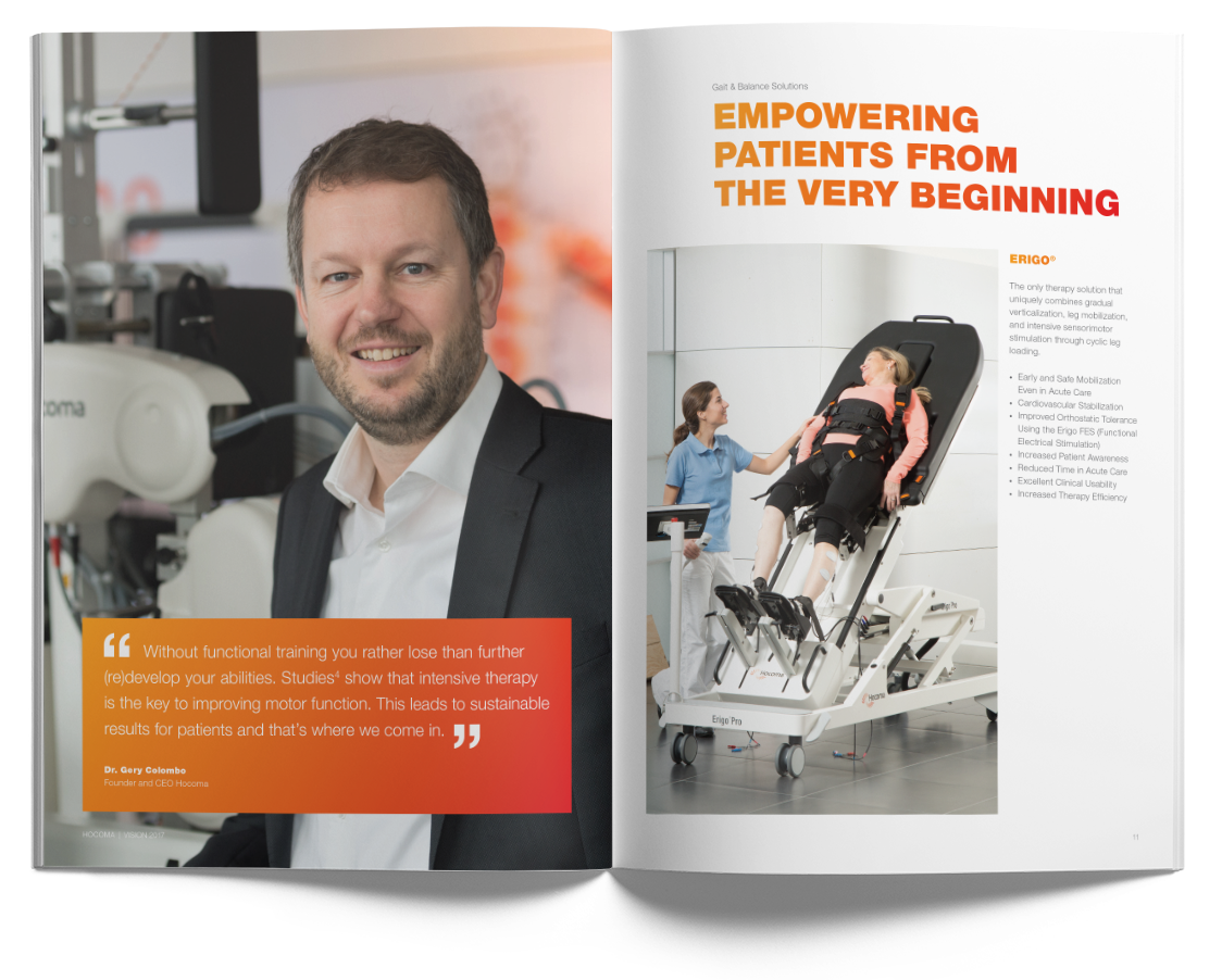
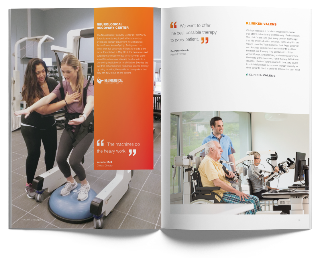
Please be careful and make sure the box doesn’t cover the main focus of the photograph.
The gradient box should be used to make the information really stand out, therefore it is advisable not to overload the design with too many highlights.
Emphasis – solid box
When there is already a gradient box in the layout but you still need to emphasize a short message (such as calls to action, promotional elements, booth numbers, etc.), you can use a solid white box over the background image. The text in the emphasis box should respect the text hierarchy – body titles with gradient fill for the main message, in combination with body copy in medium gray.
Exceptionally, in case there is no sufficient contrast with the background image, you can opt for an alternative version of the emphasis box, using the Secondary 1 color. In this case the text should always be medium gray (multiplied), respecting the same text hierarchy.
Diagrams and tables
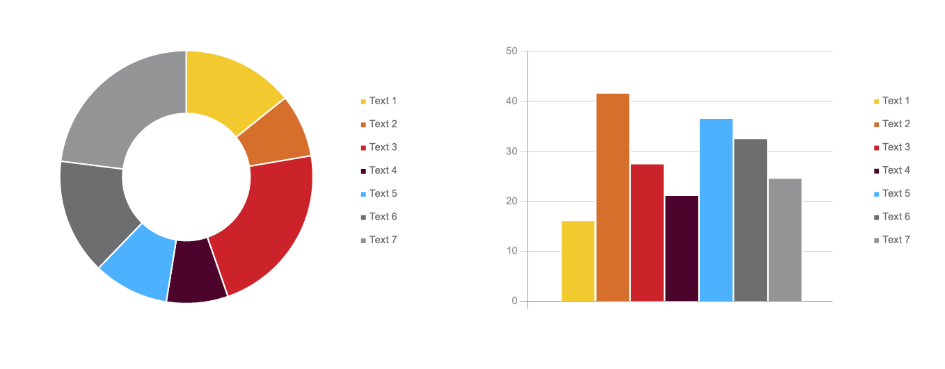
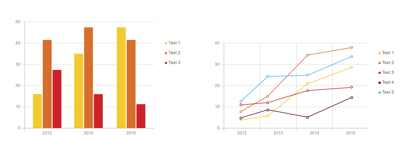
The Hocoma identity also includes diagrams and infographics that only use the secondary color palette in combination with Medium and Light Gray. Some examples of the style used for infographics in presentations:
