The Hocoma logo – the basics
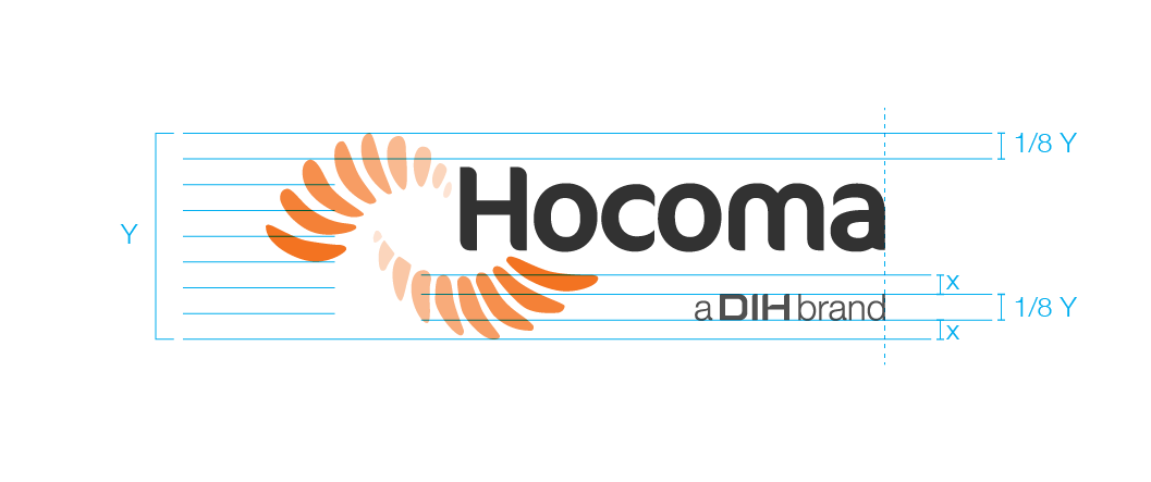
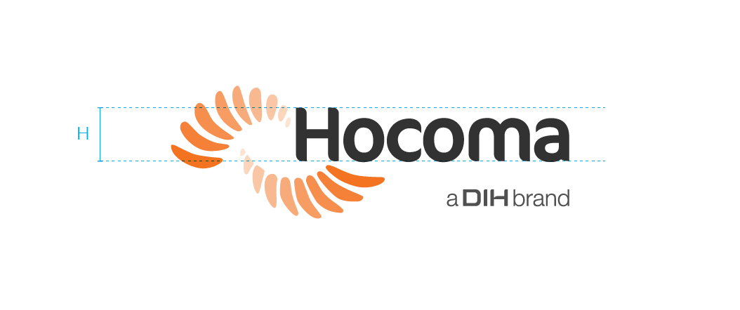
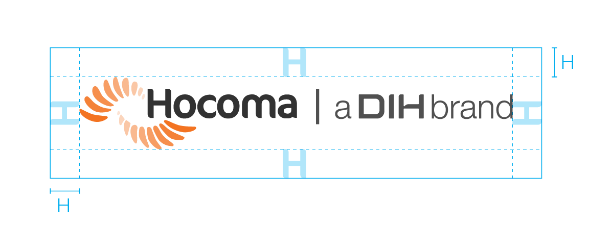
The Hocoma logo is a visual portrayal of the brand positioning. It consists of three components: the wing symbols, the text ‘Hocoma’ and the endorsement ‘a DIH brand’. A separation of any of these three elements is not allowed.
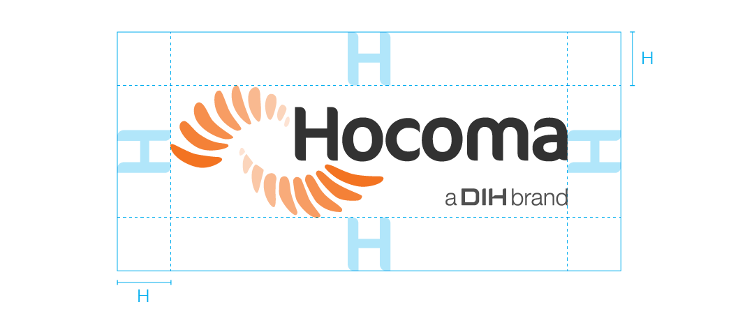
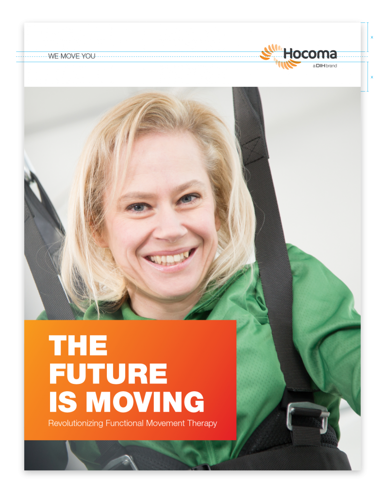
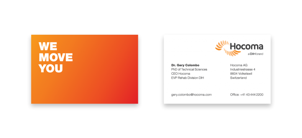
The logo is always placed on a bright background – preferably white, and it is always placed on the right – preferably the top right corner.
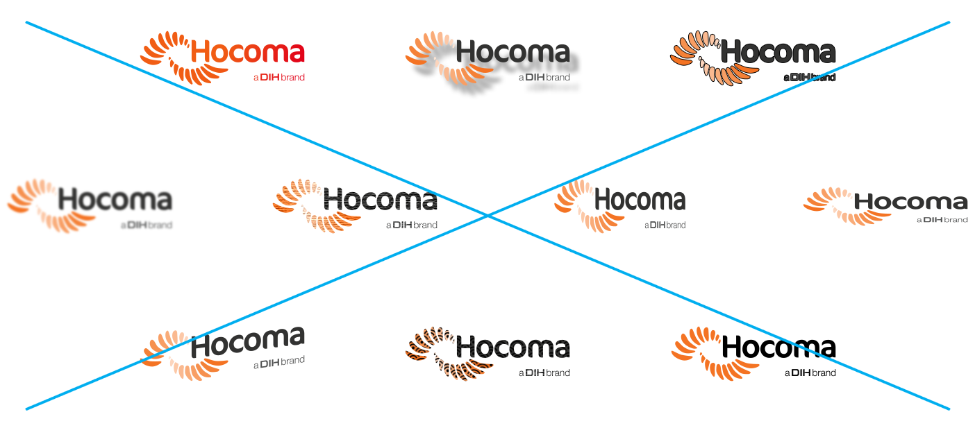
There are two configurations: a primary logo and an alternative version for use at a smaller size. Please, use the logos as provided in the download center and refrain from modifying any of its parts in size, ratio, form or colour.
Read on to discover the placement and sizing rules for both versions.
