Typography
Aligning typography will make your texts recognizable and part of the Hocoma brand. Here’s all you need to know to do so.
Aligning typography will make your texts recognizable and part of the Hocoma brand. Here’s all you need to know to do so.
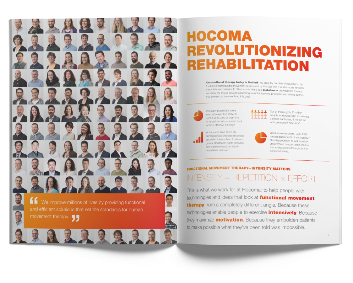
The Hocoma identity uses Helvetica Neue in two different main type weights: 95 Black and 45 Light. There are two additional weights for specific uses.
As a general rule, texts should always be left-aligned, and not-hyphenated. The use of italic cuts should be avoided. For more specific typesetting rules, please inspect and apply Indesign paragraph and character styles as set in the open files. You can download them here.
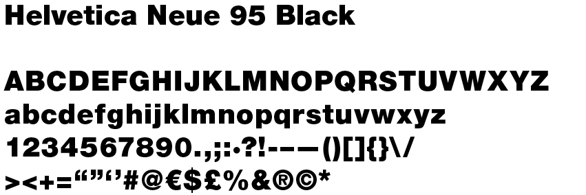
Helvetica Neue 95 Black is used for:
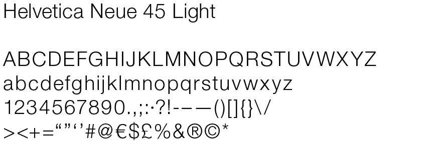
Helvetica Neue 45 Light is used, always with +10 tracking, for:
It is usually used in medium gray, otherwise in white only when placed on a gradient box or over a dark image/photograph.
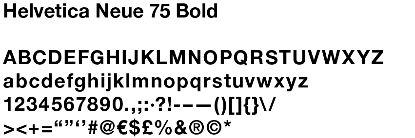
Helvetica 75 Bold is only used in very specific cases, when the black cut of the family proves too dark to be readable. Specifically for:
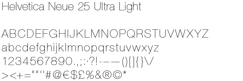
Helvetica 25 Ultra Light is used exceptionally for:
According to your case, you can use this weight in ALL CAPS or sentence case, with a tracking between +20 and +40, always with gradient fill.
The image below provides an overview of text hierarchy that should be kept in mind/respected when using paragraph and character styles. Text sizes mentioned in the overview are based on the universal format (see format and grid). For applications of different format and size – as rollup banners or posters – the copy should be arranged with a similar logic and font sizes should be in relation to the format.
